-
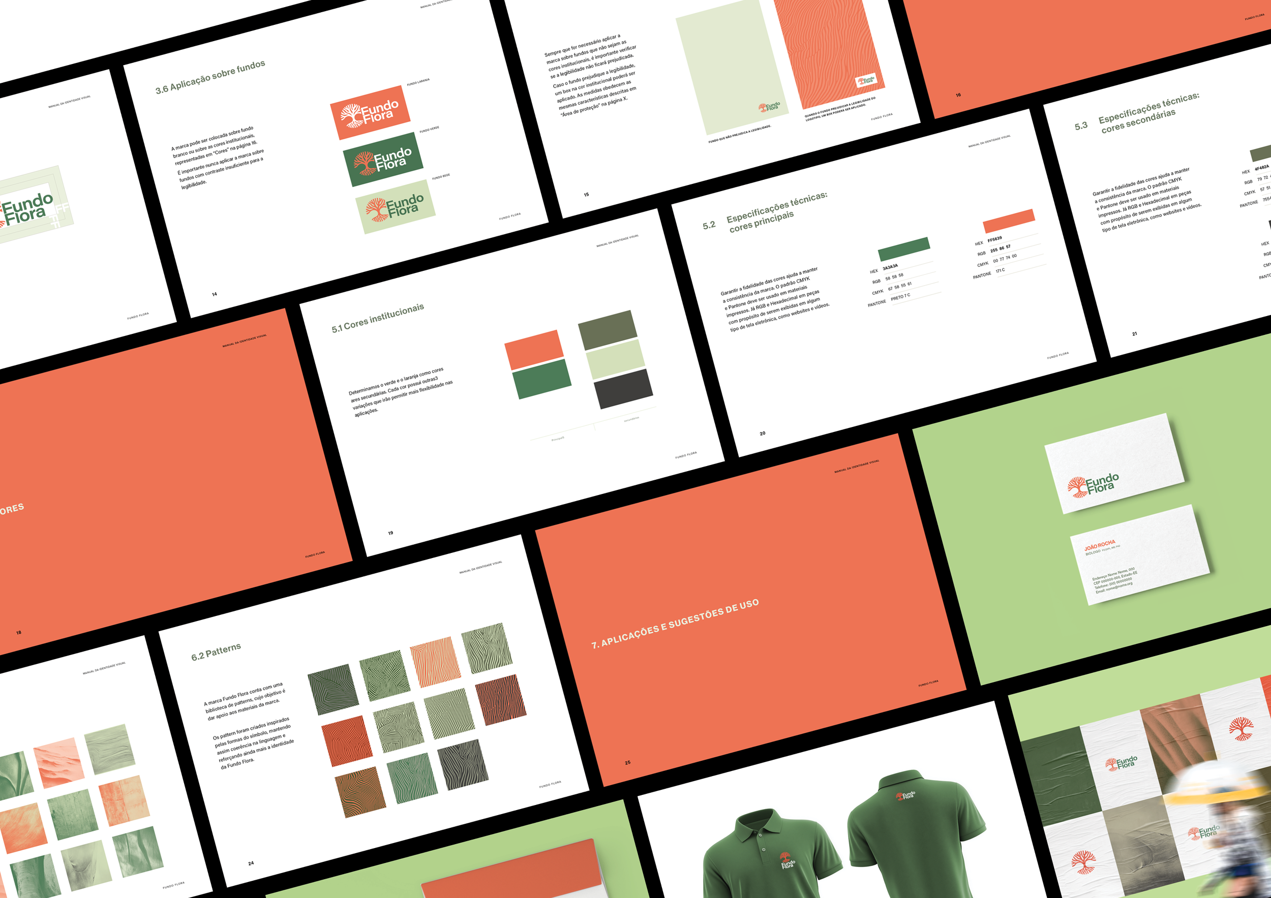
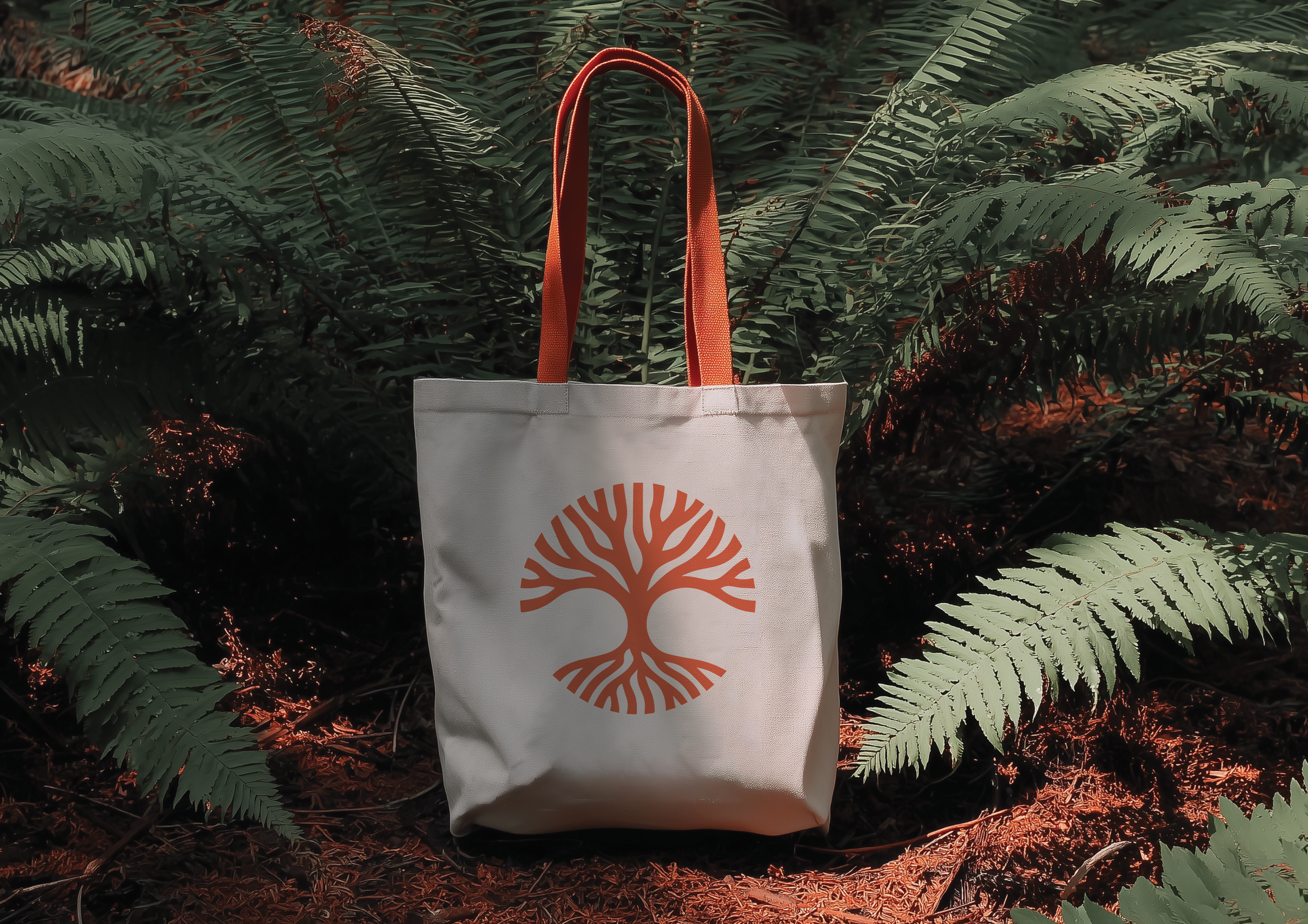
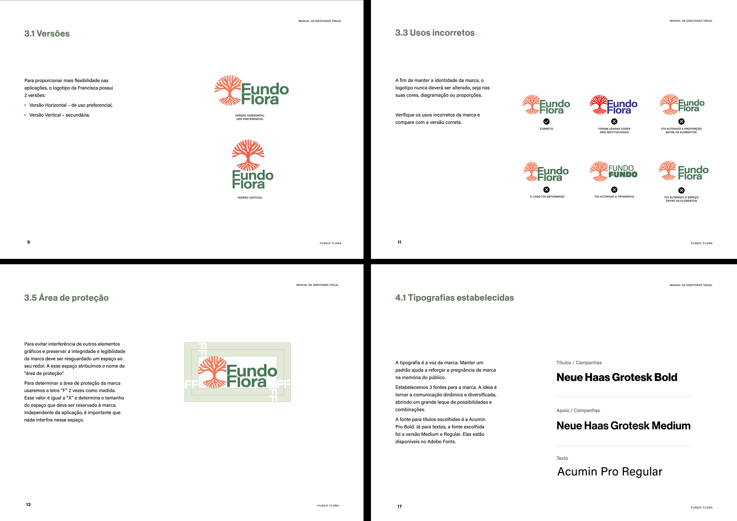
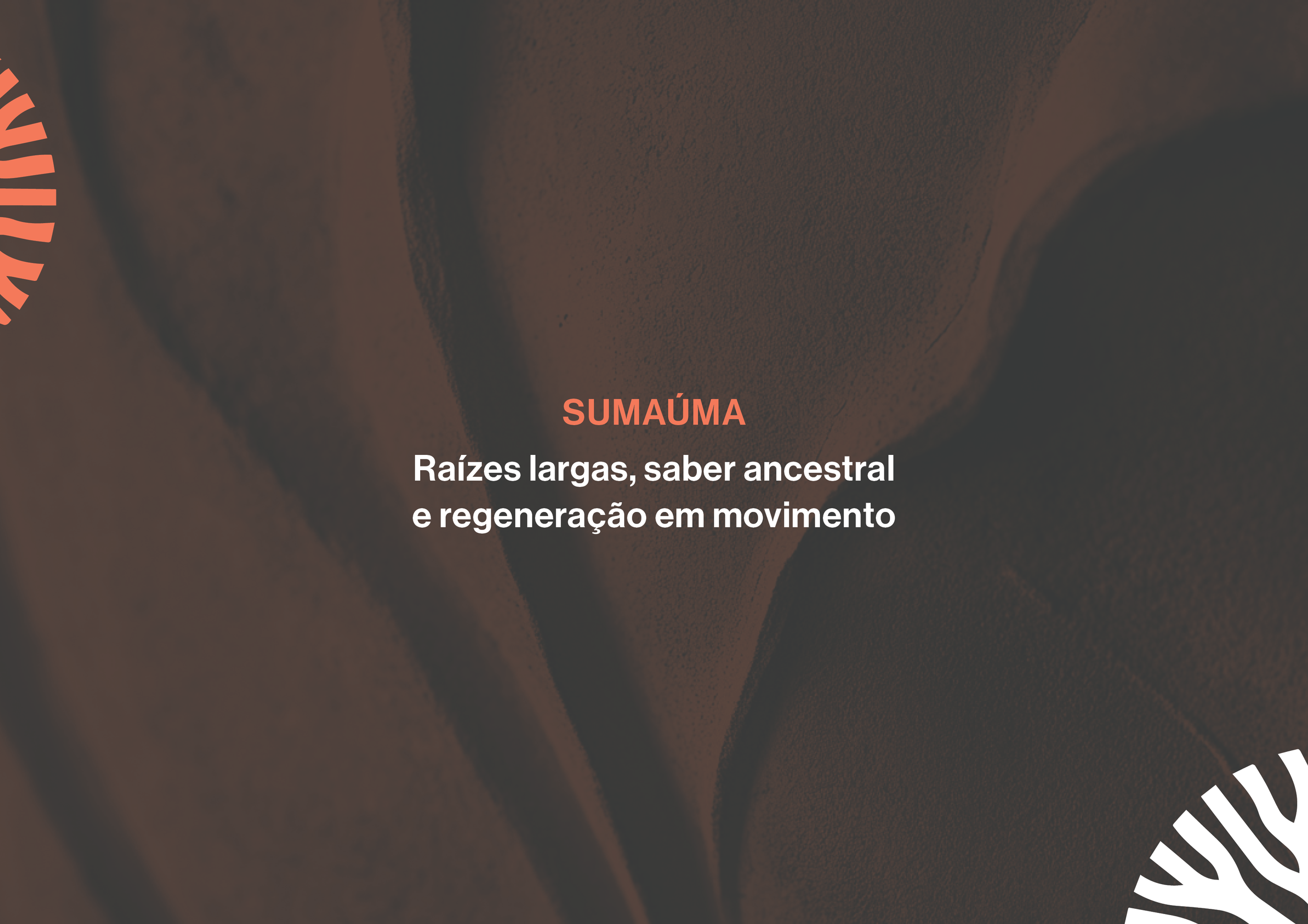
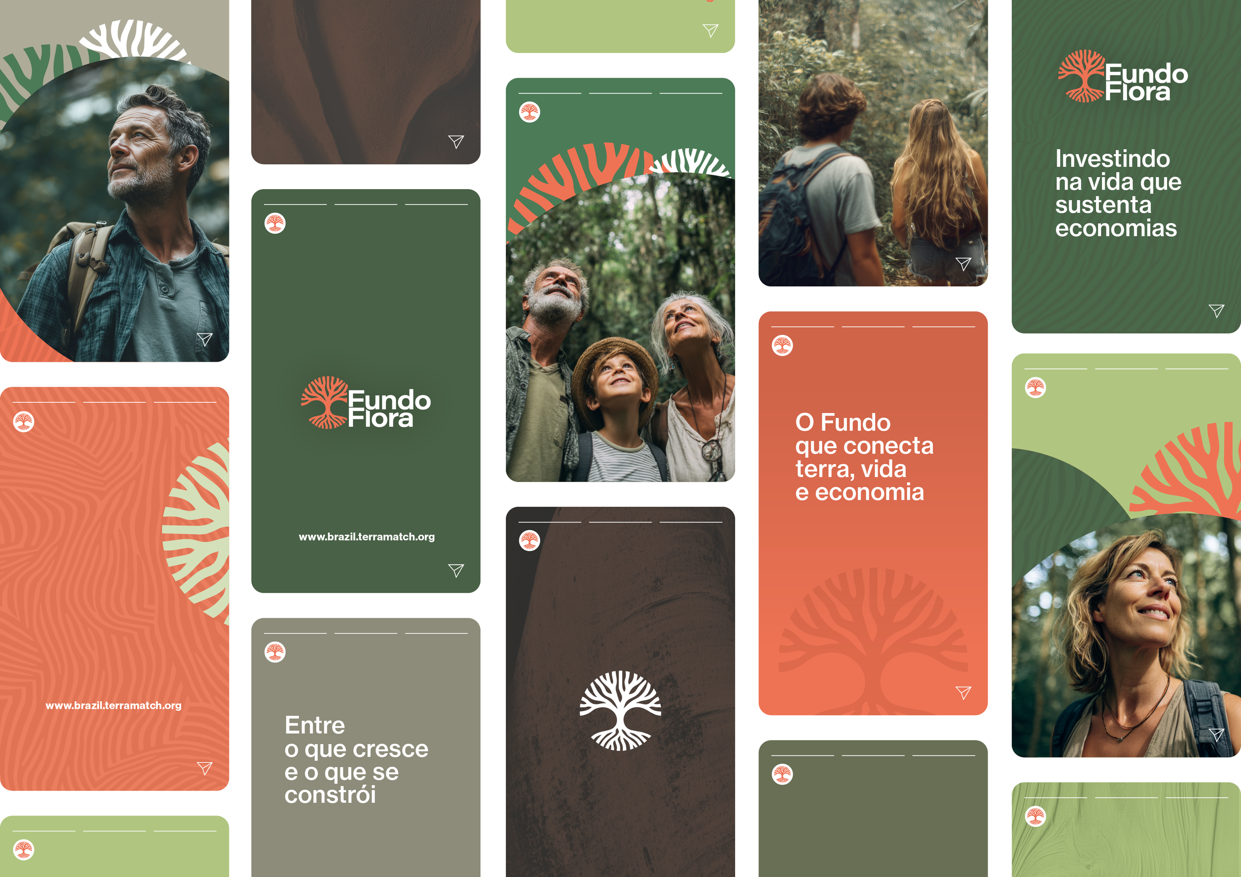
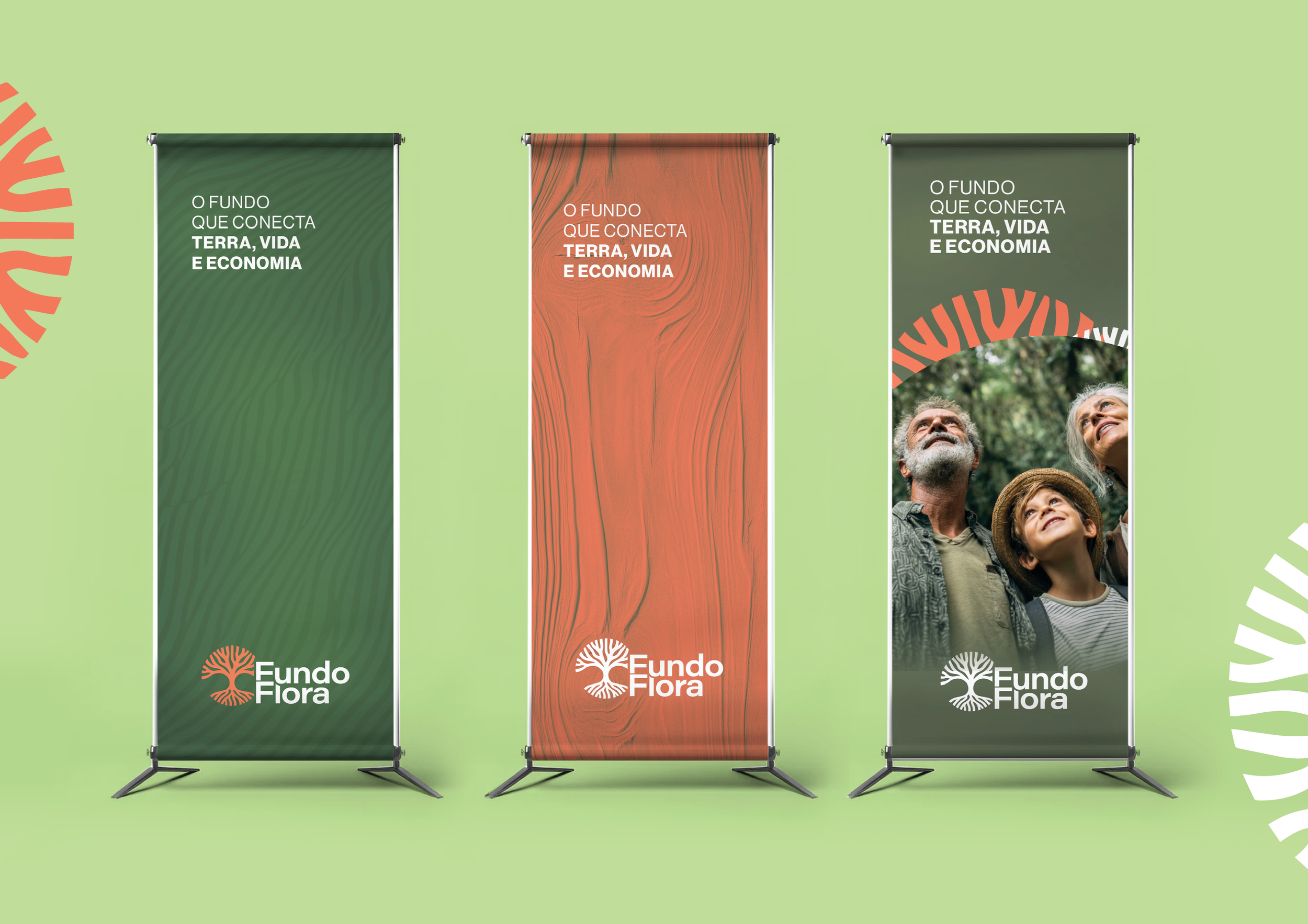
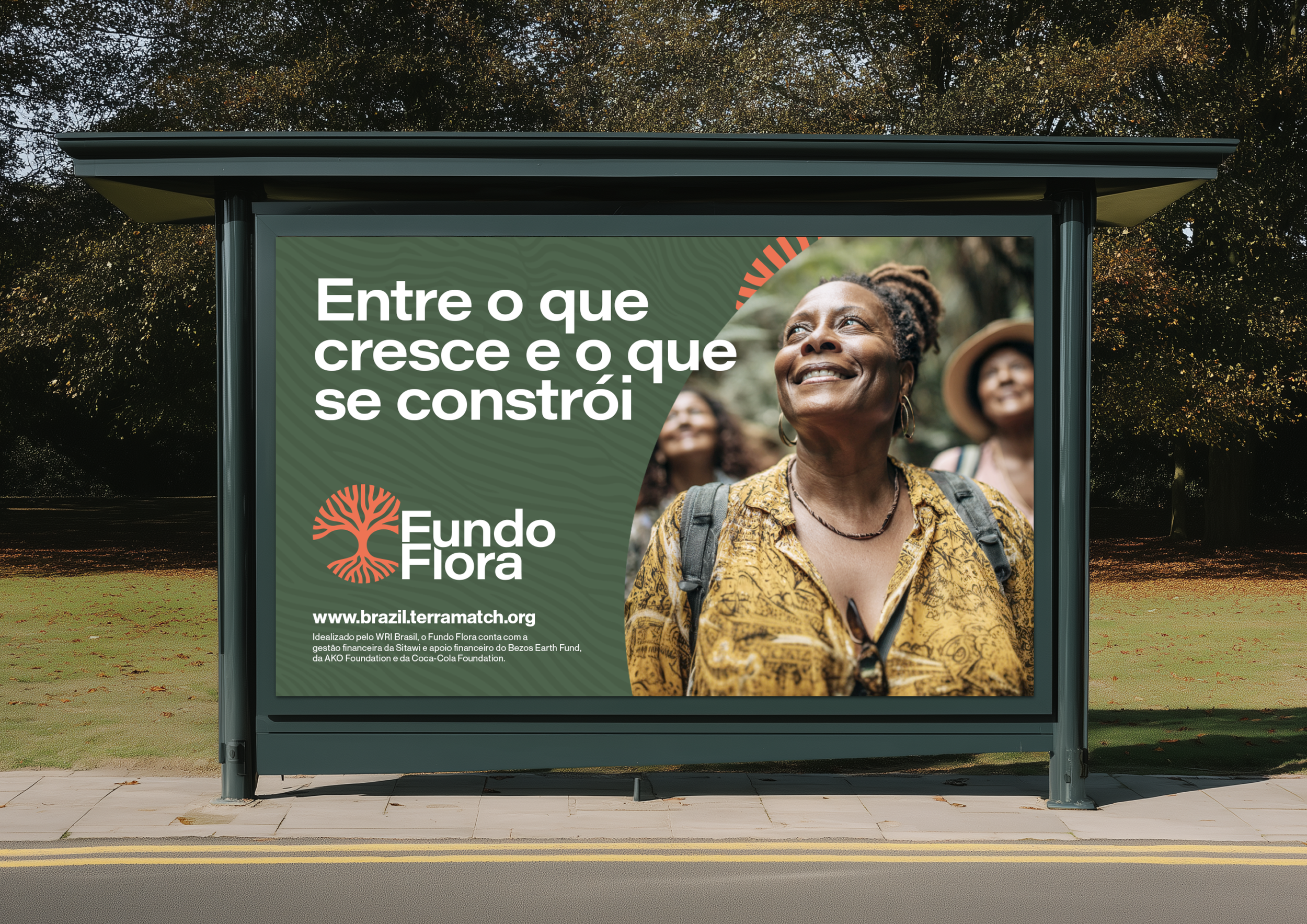
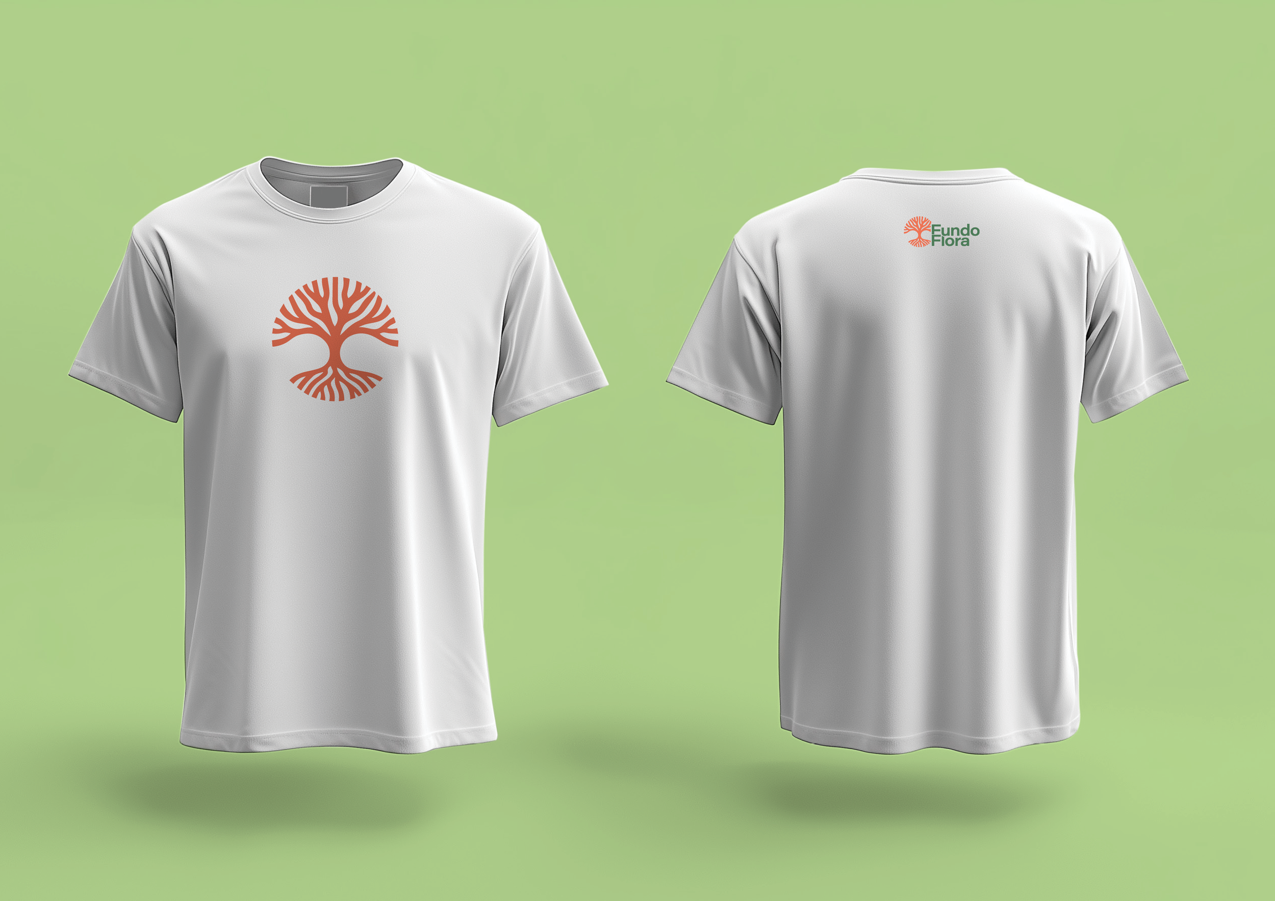
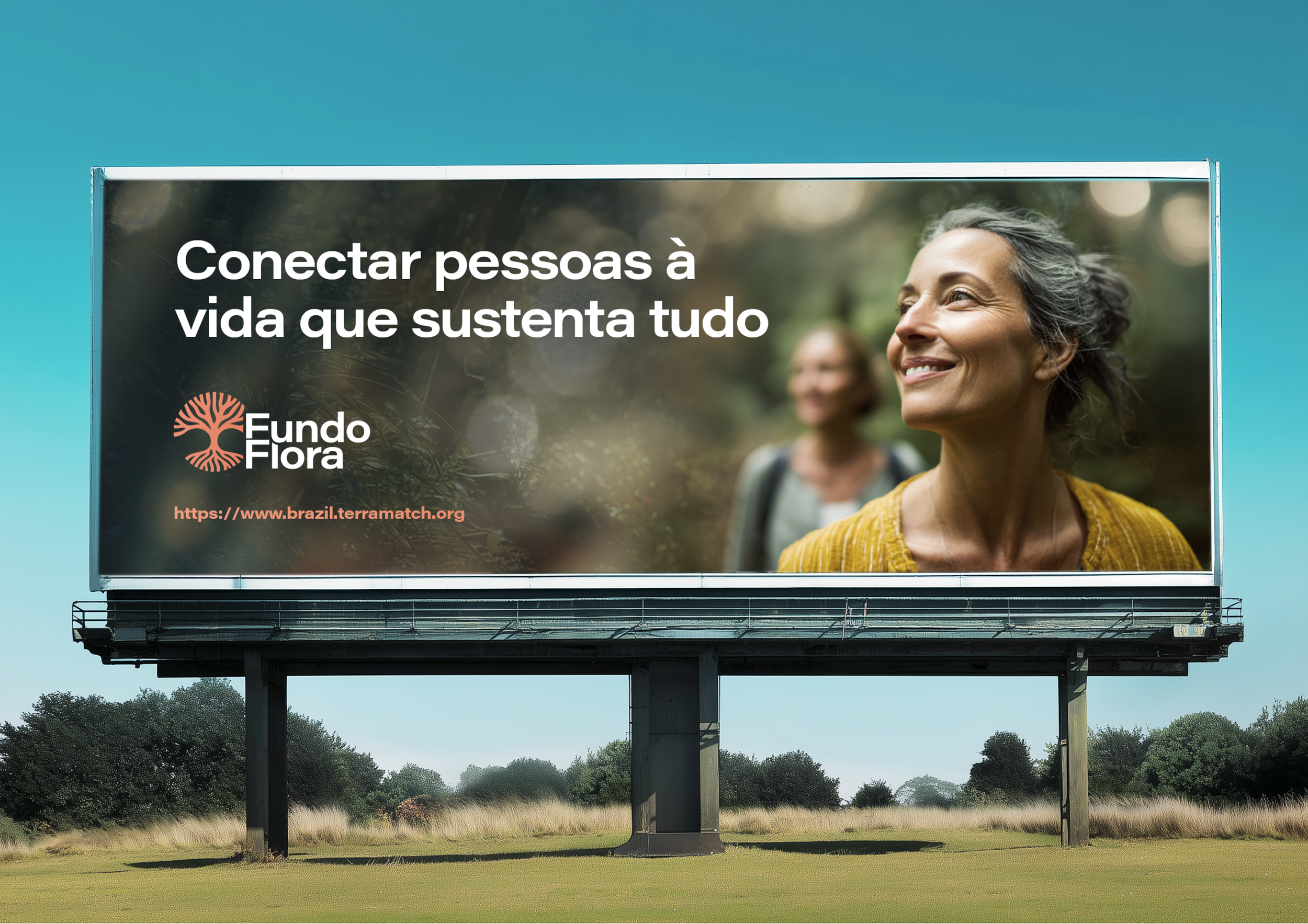
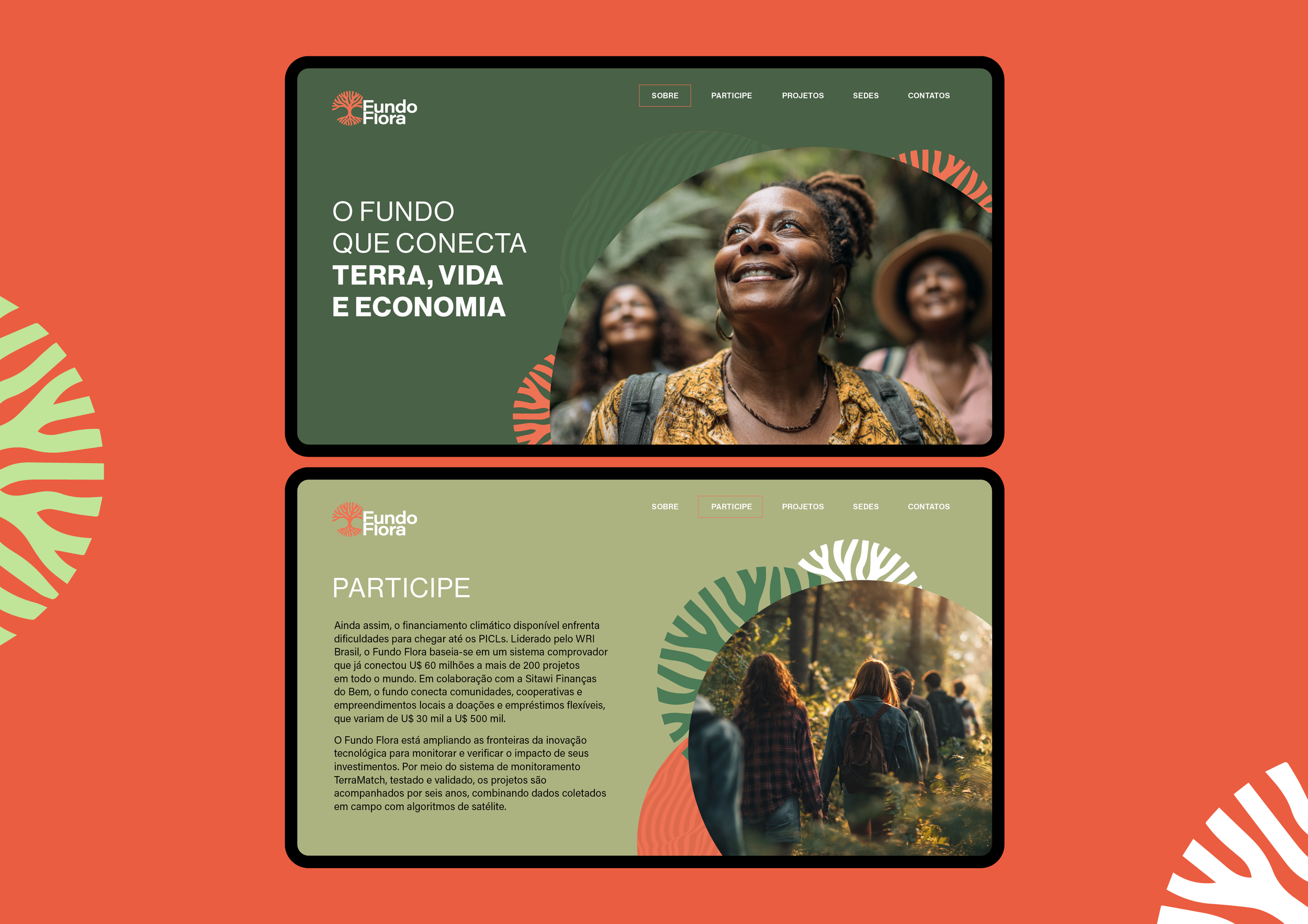
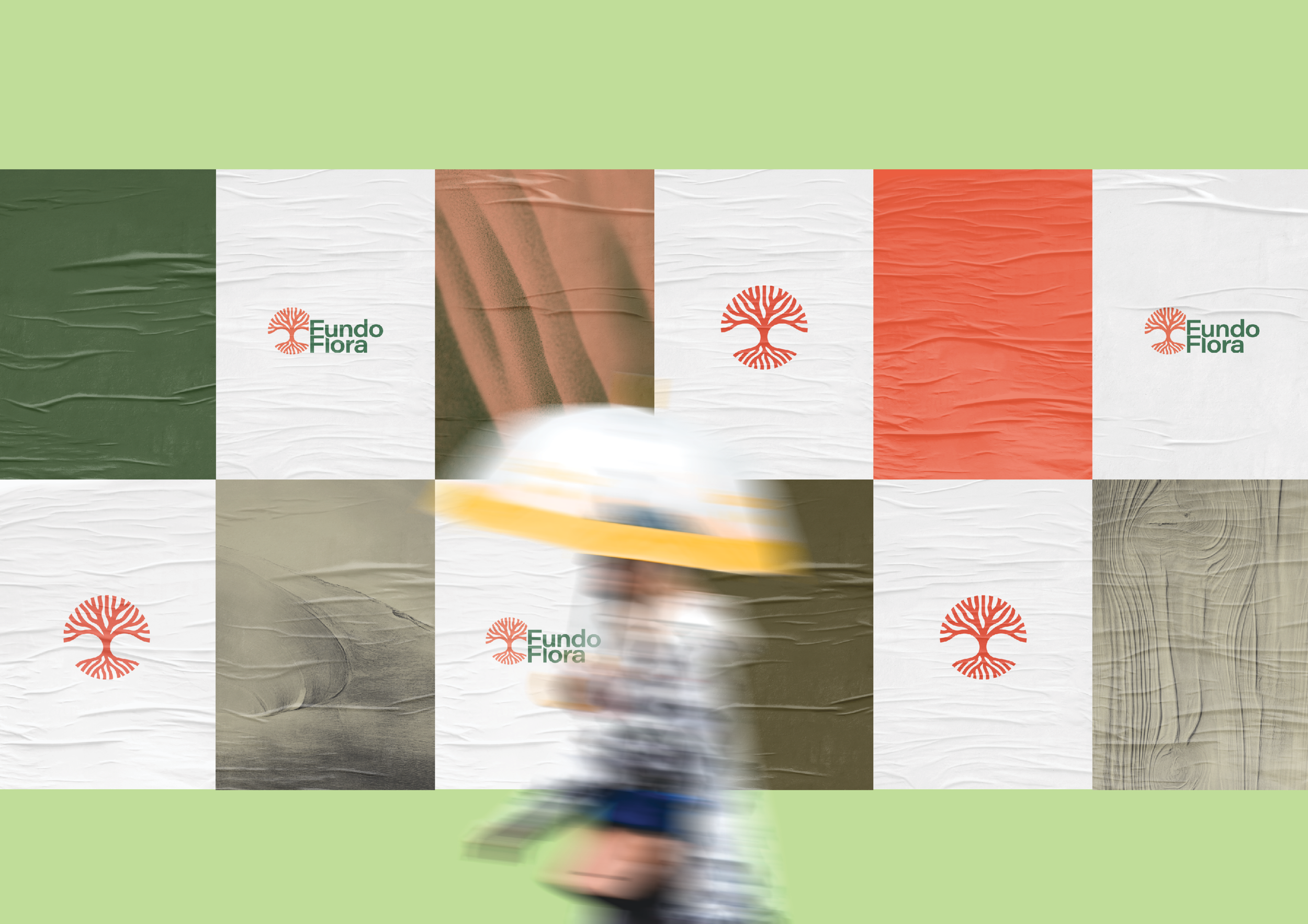
The visual identity for Fundo Flora reflects ecological restoration as a driver of socio-economic and environmental transformation, balancing institutional clarity with warmth and accessibility. Developed in collaboration with Xibe.org, the project is part of WRI Brasil, an initiative designed to connect capital, local projects, and communities in order to scale restoration across the Amazon. At its centre, a stylised icon inspired by the Sumaúma translates the tree’s wide roots and expansive canopy into a simplified, organic form, creating a sense of grounding, growth, and connection. The use of soft curves and open shapes gives the mark an approachable and human quality, while its vibrant tone introduces energy and optimism. This is contrasted with a robust, contemporary typography that anchors the identity with credibility and structure. A restrained, deep green palette reinforces stability and environmental commitment without relying on expected visual clichés. The tagline “O fundo que conecta terra, vida e economia” sits naturally within this system, bringing together a visual and verbal language that feels both inclusive and forward-looking.